 Tonight, I was digging around for an image stock photo I thought I had saved somewhere on my computer and in the process came across some screen caps/image graphics of all of my old blog designs. Boy, it sure brought back some good memories, memories I’d like to share with you – fond ones that go back to when I first started the blog and no one was reading it aka “The Early Daze.”
Bear with me as I take a long-winded trip down memory lane.
A little to-not-known-at-all-factoid about yours truly is that LONG ago, well-before I became a political junkie, I dabbled a bit in web design, but it was all HTML-based and – frankly – not that great. Creative, yeah, but great? Nah. Blog designs are (or at least mine have been) CSS-based, which I didn’t (and pretty much still don’t) have a clue how to work with. For that, I turned to the immensely talened Lisa Sabin-Wilson at Elegant Webscapes [1]. She is the only one I have ever trusted to do skins for my blog because she has always done outstanding work, taking the rough sketch ideas I give her and turning them into beautiful displays of “blog art.” It’s also important to mention that she has always been patient with me when it comes to blog design, because I am so particular and want everything “just perfect.” Most other designers would probably tell me to take a hike! ![]()
There are some who say “don’t worry about the design and instead just focus on the content.” I think it’s possible to have both. You can have a great blog design that stands out from the rest, one that isn’t too “showy” or cluttered but that will instead give away hint or two about your personality, while at the same time being reader/commenter friendly. The functionality for blog visitors has always been important to me, especially as the blog evolved and more people starting commenting. Readers like to be able to edit their comments. They like to be able to format them. They like to be able to preview them – even delete them. All those are things readers of this blog can do. Believe me, I hear it when the functionality of any of those options isn’t working right, especially the comment editor. ![]()
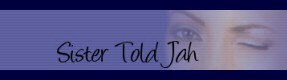
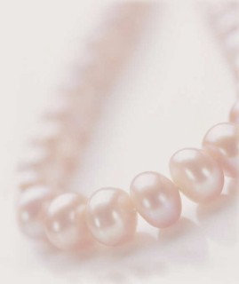
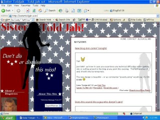
When I first started blogging, it was somewhere around September 2003 and it was a personal blog – not political at all – and for the life of me I can’t remember what I called it. I just remember it was on blogspot. The next month I created a political blog at blogspot and called it “Prezeedential Aspirations.” The “zee” part of it came from a political forum I frequented (and in fact, still frequent) where I logged in under the name “zeewoman.” I used an awful homemade design until a few months later. I don’t have a screenshot of the first official design, but at the time (Feb 2004) I picked it it was a “stock” design at Lisa’s site, and I asked her to customize it a little bit for me. Below is one of the banners she did for the blog, which appeared at the top of the page, as well as a small version of the pink pearls jpg that came with the design:

I thought it was classy, elegant, sophisticated-looking. But, over time, I came to the conclusion that I wanted something a little less starchy and a lot more fun and playful – not to mention more functional. At the time, blogspot blogs had very little useful functionality for both the blog owner and commenters. Of course, I had zero commenters at the time, as evidenced by the fact that no one commented [2] when I asked if they liked the new look! LOL. But I kept hoping they would come.
In August of 2004, the sistertoldjah.com URL was born.
That same summer, I decided that if I wanted to better promote and “sell” my blog, that it might be a good idea to not just get a domain, but to get an updated design, as well as start using a new blogging platform (Word Press [3]). Well, I ended up getting three new designs, to be exact (I got a little crazy that summer and beyond). Below are the three skins Lisa designed for me between the summer and the fall of 2004, the first one debuting in August [4] and the other two in October [5].
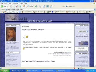
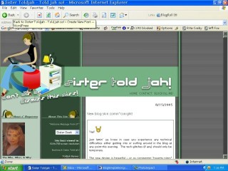
Don’t ask me why there are 2005 dates on the posts in the screencaps, when the skins debuted in 2004! No idea. Oh wait – maybe I took the screencaps right before my next design was put on the site? Dunno.
Anyway, the purplish looking one (see a bigger version here [6]) was my favorite of the three. It was stylish, flirty, and I really dug the colors. All three of them featured the image of a woman: On one, all you saw was a teasing wink, one was an image of a funky college-aged gal on her laptop, and the other looked like a sassy, sexy, take-no-prisoners type ![]() . All of the designs were three columns. At the time, there were a lot of two column blogs blogs but not a lot of three column ones. I was somewhat inspired to have a three column design done after seeing La Shawn Barber’s [7] original site design, which she no longer has. The reason for wanting more than just two columns was so I could add more links and info to each side for people to read/view/click on. In other words, I was able to maximize the amount of blog content by adding that third column.
. All of the designs were three columns. At the time, there were a lot of two column blogs blogs but not a lot of three column ones. I was somewhat inspired to have a three column design done after seeing La Shawn Barber’s [7] original site design, which she no longer has. The reason for wanting more than just two columns was so I could add more links and info to each side for people to read/view/click on. In other words, I was able to maximize the amount of blog content by adding that third column.
In December, I had Lisa design a two-column theme for me for my now-defunct “Cozmic Blonde” blog. It was a personal blog I wanted to do to separate my non-political ramblings from the political ones. I only blogged there for a few months – starting in Jan 2005 [8] – before deciding to devote all of my attention to this blog. Below is the image Lisa worked off of to create the design for that blog, which I do not have a screencap of:

Lovely, fierce, beautifully bold, fearless, superhero-y, just a hint of vulnerability. I love that image. My Twitter followers should recognize it as I am using it now for my Twitter avi [9]. I think the blog motto was “Space. Time. Continuum. Whatever.” ![]() I still have that domain name, and am not ruling out a return for the Cozmic Blonde at some point in the future!
I still have that domain name, and am not ruling out a return for the Cozmic Blonde at some point in the future!
I enjoyed the three Toldjah themes for about a year, and readers did too as it gave them a little variety when viewing the blog. I had a “skin changer” which allowed readers to click between the three of them whenever they wanted to. The only problem was that the formatting for two of the skins was slightly off in some browsers and screen sizes, and as a result the content would look like it had been dragged to outside of the columns. This was a persistent problem that at the time Lisa could not quite figure out how to fix. It was during the latter part of this design phase that blog readership began to tick up some as I had learned more about how to promote my blog. At that time I decided the design needed to be stepped up a bit.
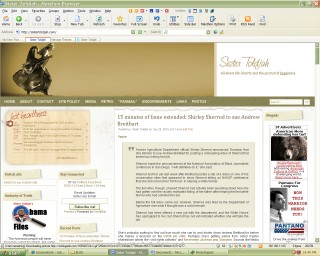
My next design, which was installed in August 2005 [10], was a lot more grown up and as I had come to believe that I would be taken more seriously if I had a blog design that was less “cutesy” and more polished. I was partially inspired by a design Lisa had done with her own blog [11] (a design that is not up anymore) in which she had her link sections in what looked like tables. I loved it. So I picked out the image that was used in the design as well as the background you see on either side, and she came up with this marvelous creation:

I really felt like I had hit the jackpot with that one, and I did. I have always been a fan of stock images that show whimsical women footloose and fancy-free, with their hair blowing in the wind and not a care in the world, and that one was one of my favorites at the time. Lisa could not have done a better job on that one if she tried. Often when I visited the site, I would just stare at it and think: this is mine! Readers often complimented me on it, but I would make sure they knew that it wasn’t me who came up with the design – as much as I would have liked to have taken credit for it! Again, I sent Lisa a few ideas – and graphics this time – and she worked her magic. As a result of this new design, I blogged a lot more, because I was so excited about the design. So it’s no small wonder that blog readership really started to pick up even more later that year.
Clearly I loved that design because this site wasn’t redesigned until January 2009 with the brilliant four-column layout you see now. Sorry if I sound arrogant about the designs; it’s more pride than anything. This one is, by far, my favorite, because of all the content options. Lisa took a lot of time to get it right as I gave her a very detailed marked up graphic of a generic four column design, and sent along with it the graphic you see in the header, requesting that the theme be in sepia-tones, of which I am a big fan. To my knowledge, there are very few four column political blog designs out there, so perhaps I “broke ground” with this one? ![]() I asked Lisa to start on it in plenty of time for me to be able to debut it before the inauguration [12] of Barack Obama. And she did – reskinning the site on January 19th, 2009 [13].
I asked Lisa to start on it in plenty of time for me to be able to debut it before the inauguration [12] of Barack Obama. And she did – reskinning the site on January 19th, 2009 [13].
The headlines section [14] was inspired by numerous sites I saw with some form of a headline section at the tops of their respective pages, including HotAir.com [15]. It’s an easy way to update the site when I don’t have a lot of time to put up a post with content included. The header graphic I adore. Doesn’t she look like she’s the happiest person on earth, tiptoeing through the field, completely uninhibited? And on top of the world. You would not believe how many people have asked me if that was me in that photo. My response? I WISH! LOL.
The absolute coolest thing about this design? 75-80% was paid for by readers who contributed to my tip jar [16]. Prior to that point, all previous designs had been paid for by me and/or by what little ad income I had coming in. But this design was sponsored in large part by readers, and I am still profoundly grateful not just for that kind of support, but for the support y’all bring me every day just by reading, commenting, emailing, Tweeting. For someone who is almost never at a loss for words, I get a little tongue-tied when talking about how much it means to me to have people interested in what I have to say, to have people come back on a day to day basis to read what I write (and to now read what my awesome co-blogger [17] writes!).
You and me, my dear readers, have done a lot of growing up together. To date, 11,686 posts have been written here – 98% of them by me, and 73,166 comments have been posted, 99% of them by readers (1% are my responses).
WOW.
To quote Sally Field, “They like me, they really, really like me!”
Thanks. Let’s keep it going, shall we?
Update/PS – 11:32: How could I forget to mention my newish (started in April 2009) personal blog Velvet Lair [18], which I (obviously) don’t update much? The design was an existing one found on a WP design site, and I modified it a little (created the header, modified the font colors, etc).