Obama’s economic recovery: the chart tells the story
**Posted by Phineas
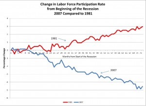
Power Line presents three charts that show what a failure Obama’s statist economic policies have been. Here’s the one that really struck me:

(Click here for the full-sized version.)
This chart from the US Senate Budget Committee compares the trend in the labor force participation rate, roughly the percentage of the working age population that is either employed or looking for work, during the recovery from recession under both President Reagan and President Obama. According to the Bureau of Labor Statistics, the 2007 recession began in December of that year. Obama entered office roughly 13 months later. Now, go to that point on both the Reagan (red) and Obama (blue) lines and trace their progress. This shows clearly that Obama’s economic policies have been a nightmare for working people, with hundreds of thousands, at least, just giving up looking for work.
Why on Earth, then, should any responsible citizen wish to vote for any candidate that promises to continue those same devastating policies?
(Crossposted at Public Secrets)
